You found a soft gray that looked perfect on the chip, painted a wall, and now it reads lavender in the morning and gloomy blue by dinner. Picking paint colors feels like it should be easy, yet a tiny swatch under store lighting tells you very little about how a color will behave on four walls in your own light.
This guide gives you a repeatable process: start from the finishes that are not changing, identify undertones, use LRV (light reflectance value) to choose how light or dark to go, test samples the right way, and account for the direction your windows face. You will also learn the 60-30-10 rule for building a palette and which sheen to use in each room.
Quick answer: Choose colors whose undertones match your fixed finishes, like flooring, countertops and tile. Use LRV to pick the depth: higher numbers reflect more light and suit darker rooms. Narrow it to two or three options, test large samples on several walls, and check them in morning, afternoon and evening light for a few days before you buy gallons.
Start with what is not changing
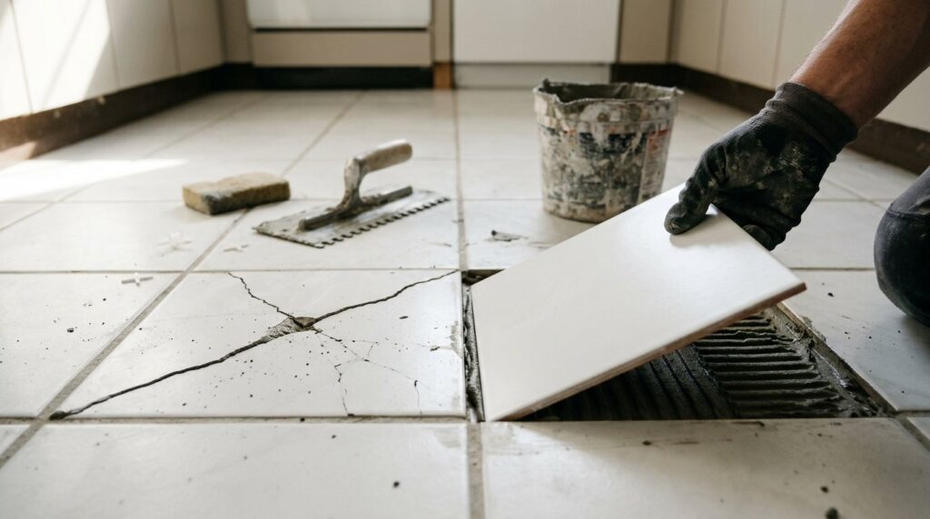
Paint is the easiest finish in a room to change, so it should follow the finishes that are hard or expensive to replace. Countertops, backsplash and floor tile, carpet, a stone fireplace and stained wood all have their own undertones, and the wall color has to get along with them. Large vertical surfaces, like a tiled wall or cabinets, usually have more influence than a floor.
Bring samples to those finishes, not the other way around. Hold each sample flat against the countertop or flooring and note which ones look clean and connected and which ones look muddy or clash. That one step rules out most wrong choices before you buy anything.
How to find a paint color’s undertone
What undertones are
Almost every paint color, especially a neutral, has a subtle second color underneath. Warm undertones lean yellow, orange, red or pink. Cool undertones lean blue, green or purple. The undertone is what makes one beige look peachy and another look greenish, even when both are labeled beige.
| Color family | Common undertones | What you may see on the wall |
|---|---|---|
| Gray | Blue, green or purple | Icy, minty or lavender casts, especially in cool light |
| Greige | Green | A faint olive tint next to warm wood |
| Taupe | Purple or pink | A mauve look in warm afternoon light |
| Beige | Orange, pink or yellow | Peachy or salmon tones next to cool whites |
| Cream and tan | Yellow | Buttery or dingy beside bright white trim |
| White | Usually yellow, but any color is possible | Creamy, gray, pink or blue depending on the room |
How to spot an undertone
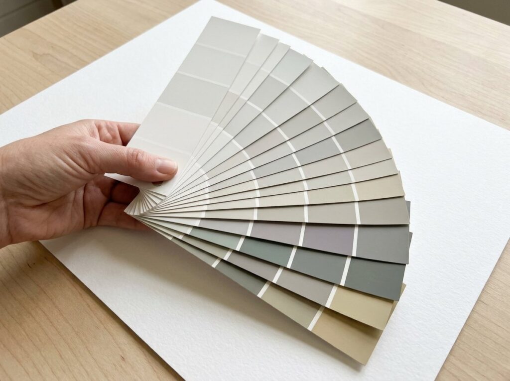
- Compare, do not judge alone. A color seen by itself hides its undertone. Line up several similar grays or beiges side by side and the differences jump out.
- Use a white reference. Hold the chip against a plain sheet of bright white printer paper. Any leaning toward yellow, pink, green or blue becomes easier to see.
- Look at the darkest color on the strip. The deepest shade on a paint strip shows the undertone most clearly, and lighter shades on the same strip share it.
- Check against trim and ceiling. A warm cream white can look yellow next to a cool gray wall, so match undertones across walls, trim and ceilings.
What LRV tells you about a color
LRV, or light reflectance value, measures how much light a color reflects on a scale from 0 (pure black) to 100 (pure white). Real paints fall roughly between 2 and the mid-90s. You can usually find a color’s LRV on the back of the chip or on the manufacturer’s color page.
A practical way to use it is to sort colors into depth ranges. The bands below follow a common designer breakdown:
- White: about 82 to 95
- Off-white: about 73 to 81
- Light: about 55 to 72
- Light-medium: about 40 to 54
- Medium: about 20 to 39
- Medium-dark and dark: about 2 to 19
If you want a room to feel bright, look for colors around 70 or higher, and go higher still in a dim or north-facing room. A low LRV is not a mistake: a deep color in a small den or powder room can feel cozy on purpose. Remember that sheen matters too, since satin and gloss reflect more light and read slightly lighter than the same color in matte.
Pro tip: Very light whites and off-whites can look gray in a room without much natural light, because there is not enough light for them to reflect. In a dim room, a soft white with a gentle warm undertone often looks cleaner than the brightest white on the rack.
How light direction changes color
The same paint can look like two different colors in two rooms of the same house. The direction your main windows face changes both the amount and the warmth of daylight, and that shifts how undertones show.
- North-facing rooms get steady, cool, indirect light with few shadows. Cool grays and blues can look flat or gloomy, so colors with a little warmth usually balance the space.
- South-facing rooms get strong light that can wash out pale colors at midday and turn golden in the afternoon. Cooler colors and slightly deeper shades hold up well.
- East-facing rooms are bright and warm in the morning, then flatter and cooler in the afternoon.
- West-facing rooms are dull in the morning and very warm, even orange, in late afternoon. Colors with a bit more depth or undertone tend to cope better than very flat ones.
When a room has windows on two sides, the largest or brightest window usually dominates. At night, your bulbs take over: bulbs around 2700K look warm and yellowish, while 4000K and higher look cooler and bluer. Test samples under the bulbs you actually use.
How to test paint samples the right way
Tools and materials
- Sample pots or large peel-and-stick samples of your top two or three colors
- White poster board or sample boards, plus a small foam roller or brush
- Painter’s tape and a sheet of bright white paper for comparison
Step by step
- Narrow the field. Use undertones and LRV to cut your list to two or three colors. Testing ten colors at once only adds confusion.
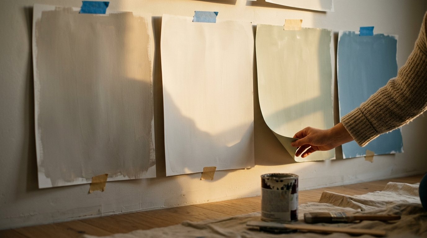
- Go big. Paint two coats on a large piece of white poster board, leaving a white border. Small patches look darker and are hard to judge.
- Avoid painting squares side by side on the old color. The existing wall color surrounds the sample and changes how you see it. Boards or peel-and-stick samples avoid that problem.
- Move samples around the room. Tape them next to the window, on the darkest wall, beside trim and near the floor or countertop.
- Check at different times. Look in the morning, at midday, in late afternoon and at night with lamps on. Give it two or three days.
- Step back. Judge from across the room at eye level, the way you will see the walls every day.
Use the 60-30-10 rule to build a palette
The 60-30-10 rule is a simple way to balance color in a room. About 60 percent is the dominant color, usually the walls. About 30 percent is a secondary color that adds contrast, such as cabinets, an accent wall, built-ins or large furniture. The last 10 percent is the accent: pillows, art, lamps or a rug.
For example, a bedroom might have light gray walls (60), soft white trim and bedding (30) and warm wood with a few colorful accents (10). Behr’s guide to the 60-30-10 rule shows more room-by-room combinations. For a whole house, keep connected spaces like hallways in one neutral and vary the depth room to room using shades from the same strip.
Choose the right sheen for each room
Sheen affects how a color looks and how well the wall stands up to cleaning. Higher sheen is more washable but shows every bump and patch.
| Sheen | Look | Best for |
|---|---|---|
| Flat or matte | No shine, hides flaws | Ceilings, adult bedrooms, low-traffic rooms |
| Eggshell | Soft, low glow | Living rooms, dining rooms, bedrooms |
| Satin | Pearl-like sheen, wipes clean | Kitchens, bathrooms, hallways, kids’ rooms |
| Semi-gloss | Noticeably shiny, very durable | Trim, doors, cabinets |
| High gloss | Glass-like shine | Accent doors and furniture |
For more detail, read our guide to paint finishes explained. Once you have chosen your color and sheen, use our free paint calculator to work out how many gallons to buy.
Common color mistakes to avoid
- Choosing from a small chip under store lighting
- Ignoring the undertones in your floors, counters and tile
- Picking the brightest white for a dim room, where it can look gray
- Testing on one wall only, or only in the evening
- Choosing the trim white separately from the wall color
When to call a pro
Color is a decision you can make yourself, but outside help is worth it in some cases:
- An open floor plan where many rooms are visible at once and colors need to flow
- Fixed finishes with tricky or mixed undertones, such as busy granite or multiple wood tones
- Exterior colors that must suit roofing and brick or follow HOA rules
- A big color change, especially light over dark, that you do not have time to paint yourself
Many paint stores offer color help, and independent color consultants usually quote by the hour or project. If you hire painters, Angi’s room painting cost guide puts the average at around $1,100 per room, with most homeowners paying $400 to $1,600, or about $2 to $6 per square foot. Covering a dark color usually needs extra coats; see our guide on how to paint over dark colors.
Frequently asked questions
How do I know if a paint color is warm or cool?
Compare it side by side with similar colors and against bright white paper. If it leans yellow, orange, red or pink it is warm; if it leans blue, green or purple it is cool. The darkest shade on the same strip usually makes the undertone obvious.
What is a good LRV for a dark room?
For a dim or north-facing room that you want to feel bright, look for colors around 70 or higher. Keep in mind that the room still needs light to reflect, so good lamps matter as much as the number.
Why does paint look different on the wall than on the chip?
A large wall reflects light onto itself, which intensifies color, and your daylight and bulbs differ from store lighting. Undertones that were invisible on a small chip become obvious over a whole room, which is why large samples matter.
What color should I paint a north-facing room?
Colors with a warm undertone, such as soft whites, warm greiges and creamy neutrals, usually look best because they offset the cool light. Very cool grays and blues can look flat there.
Should every room in a house be the same color?
No, but connected spaces look calmer when colors relate. Use one neutral for hallways and open areas, and choose room colors with similar undertones or from the same paint strip.
The bottom line
Choosing a paint color is a process, not a guess. Match undertones to your fixed finishes, use LRV to pick the right depth for your light, test big samples on several walls at different times of day, and choose a sheen that suits how the room is used. Taking a few days to test is far cheaper than repainting.